UBS E-Banking
Designing at Scale with Swiss Precision
UBS E-Banking
Chronology & scale
This project took place in 2018, early in my career journey, when I joined Namics (now part of Merkle). It was a massive multi-year engagement operating at an enterprise scale, vastly different from a rapid side project or a standalone digital product. I spent months embedded in this initiative, which served as a foundational milestone that heavily influenced my subsequent approach to complex UX architecture and systems thinking.
The challenge
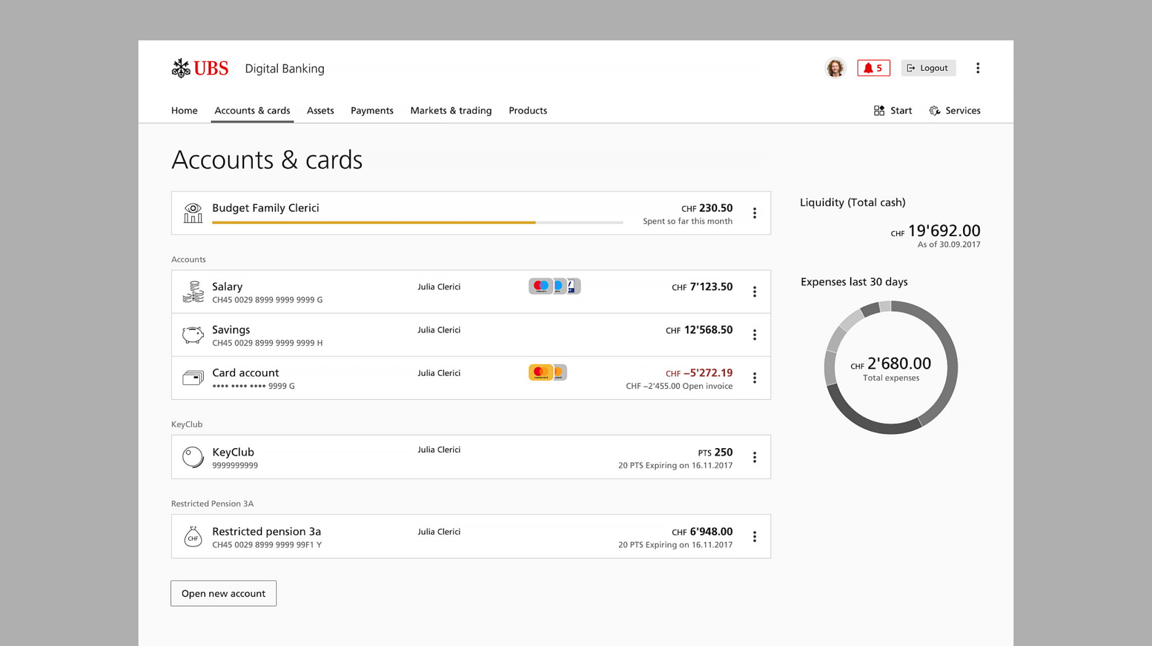
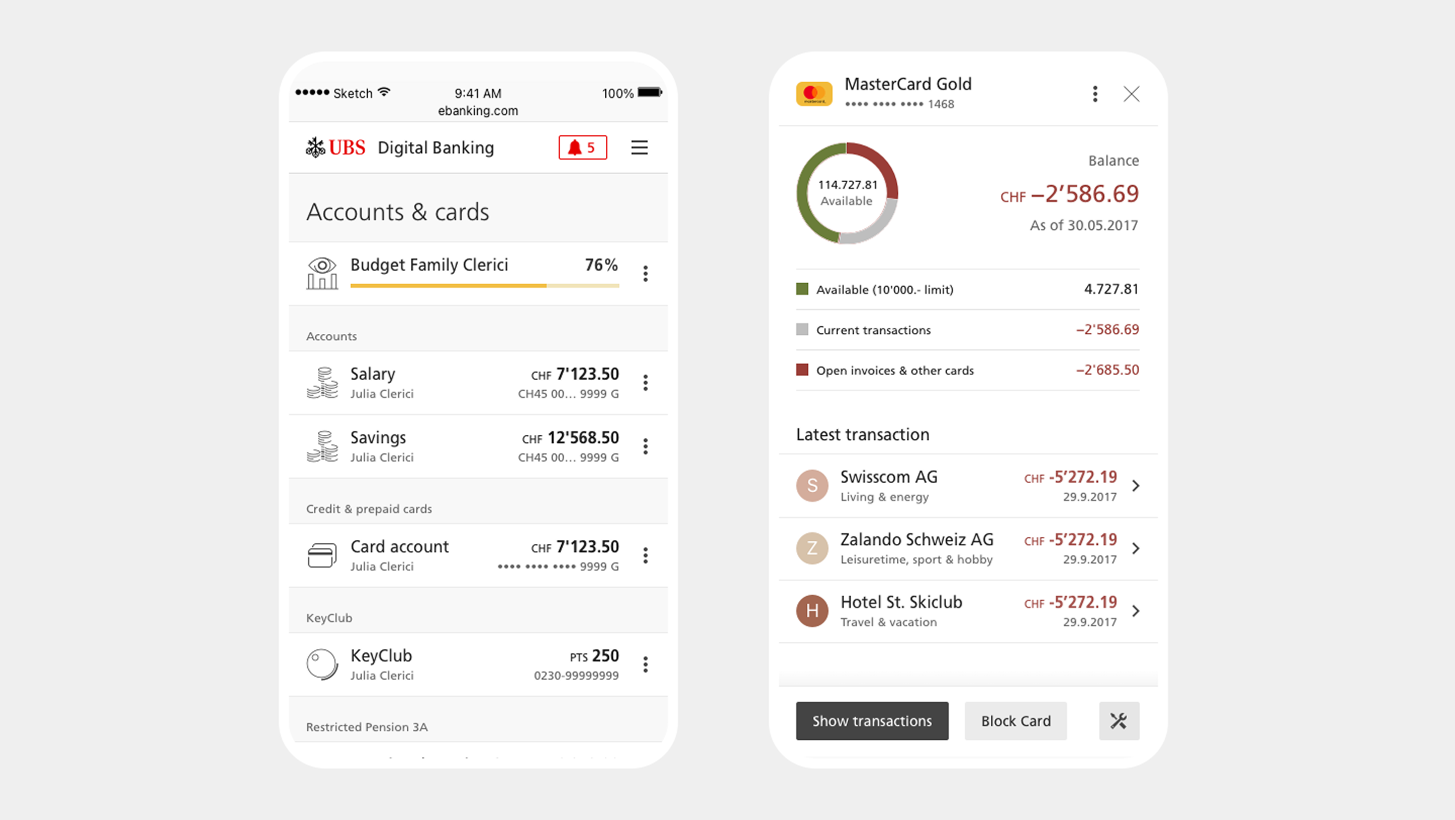
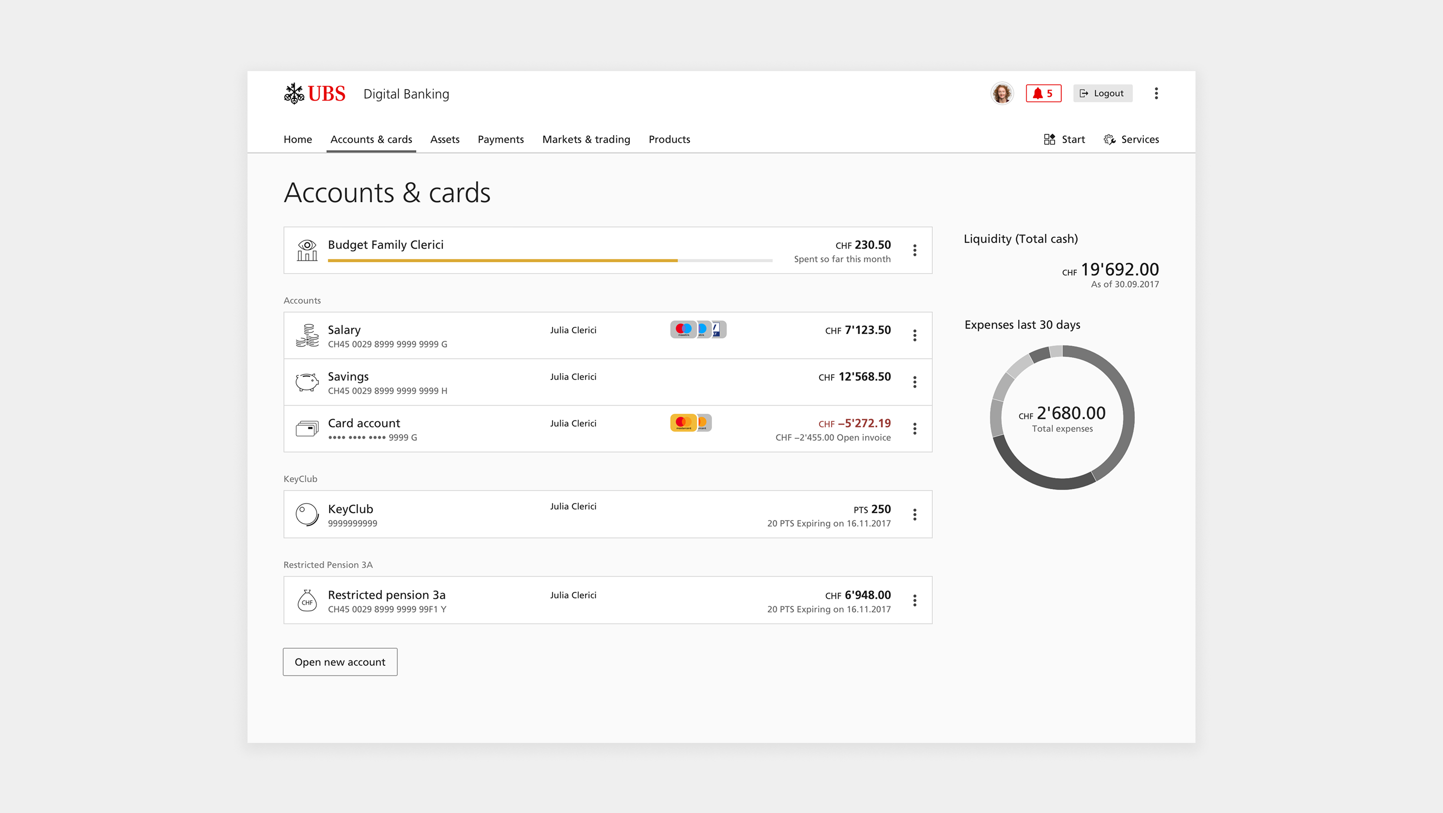
We were tasked with designing e-banking experiences for UBS—one of Switzerland's largest banks—during a major digital transformation. Working across accounts, cards, payments, and transaction management, the goal was to shape a consistent experience across a rapidly growing ecosystem of digital products.
My contribution
Within a large, multi-tiered project team—where roles spanned across UI, interaction, UX, management, and strategy—I focused on designing and refining the interaction behaviors for the core transaction management and payments modules. This role required close, daily collaboration across disciplines, working alongside other designers, product managers, frontend developers, and stakeholders—who were always embedded with us during meetings—to ensure our solutions met the bank's strict implementation standards.
Building the Product and the System
Our integrated product team worked in intense, value-driven two-week design sprints. Rather than treating the UX process like a rigid checklist, every sprint required deep critical thinking to balance business goals, technical constraints, and user needs.
To maintain momentum and secure alignment, we regularly traveled to Switzerland for intensive workshops, planning sessions, and direct stakeholder design reviews.

The unexpected hitch: building the engine while driving it
In many portfolios, projects run flawlessly. This one presented a unique, complex challenge: we were building the e-banking product and the corporate design system at the same time.
- The problem: We initially designed features in isolation, assuming the foundational components would naturally stabilize. Instead, we hit a massive speedbump: early component implementations frequently broke when subjected to complex, real-world banking data and edge cases.
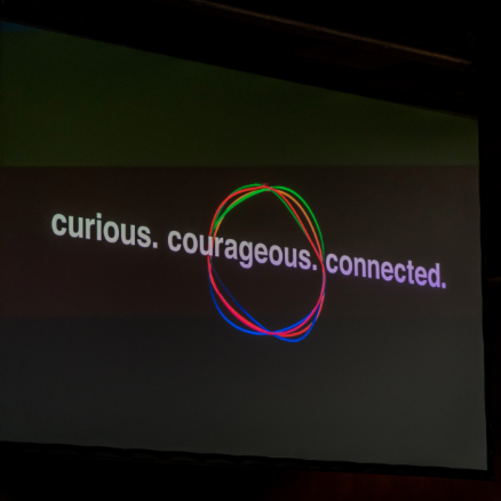
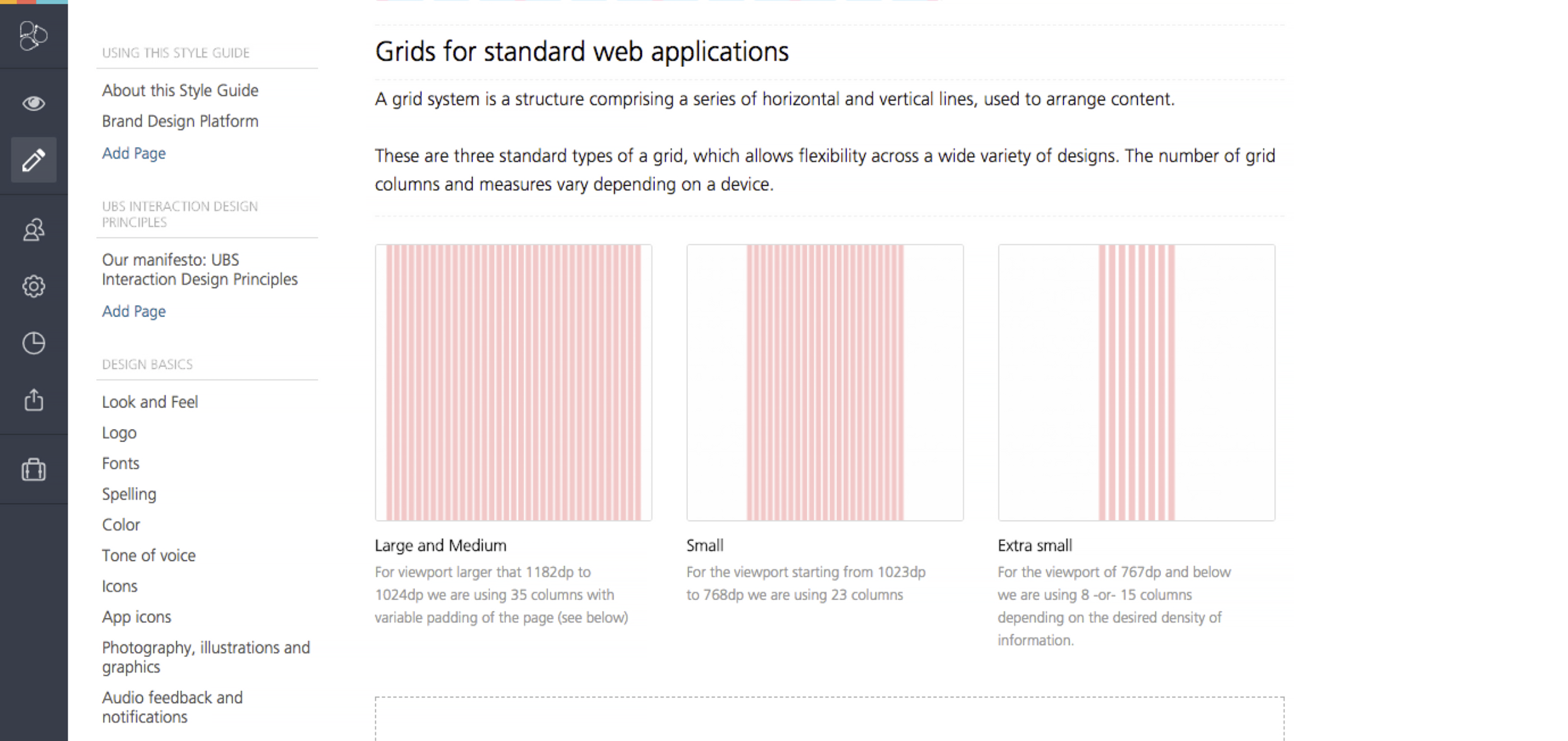
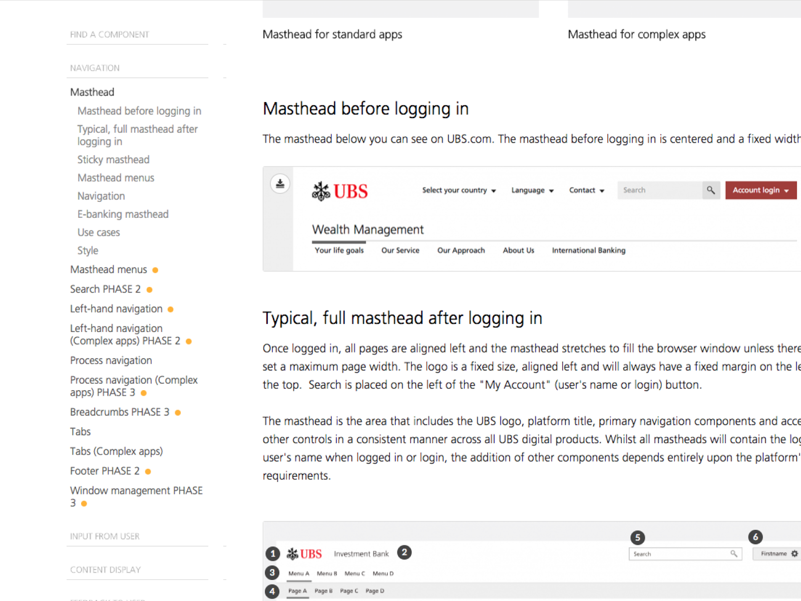
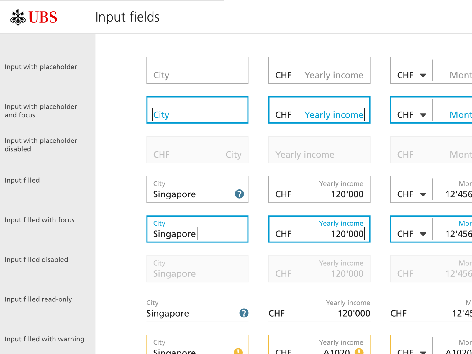
- The pivot: We stopped treating the design system as a static, isolated library. Instead, every screen we designed for the e-banking app immediately informed the system. We expanded our focus beyond UI components to build a comprehensive source of truth in Frontify. Here, we co-wrote the UBS Design Principles—our interaction manifesto—and documented everything from design basics like look and feel, typography, and tone of voice, to advanced behaviors like audio feedback and notification rules.
Precision in Practice
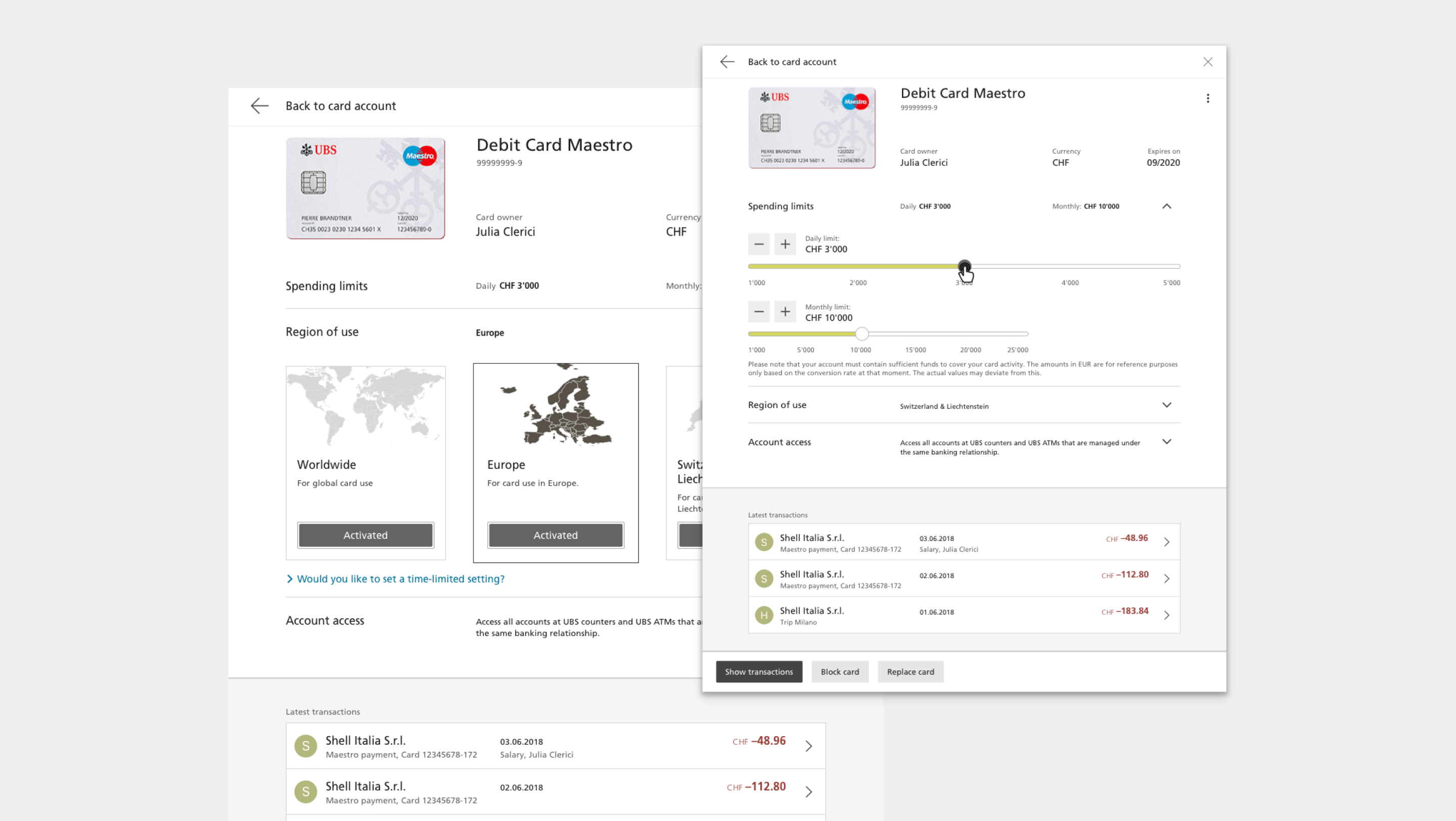
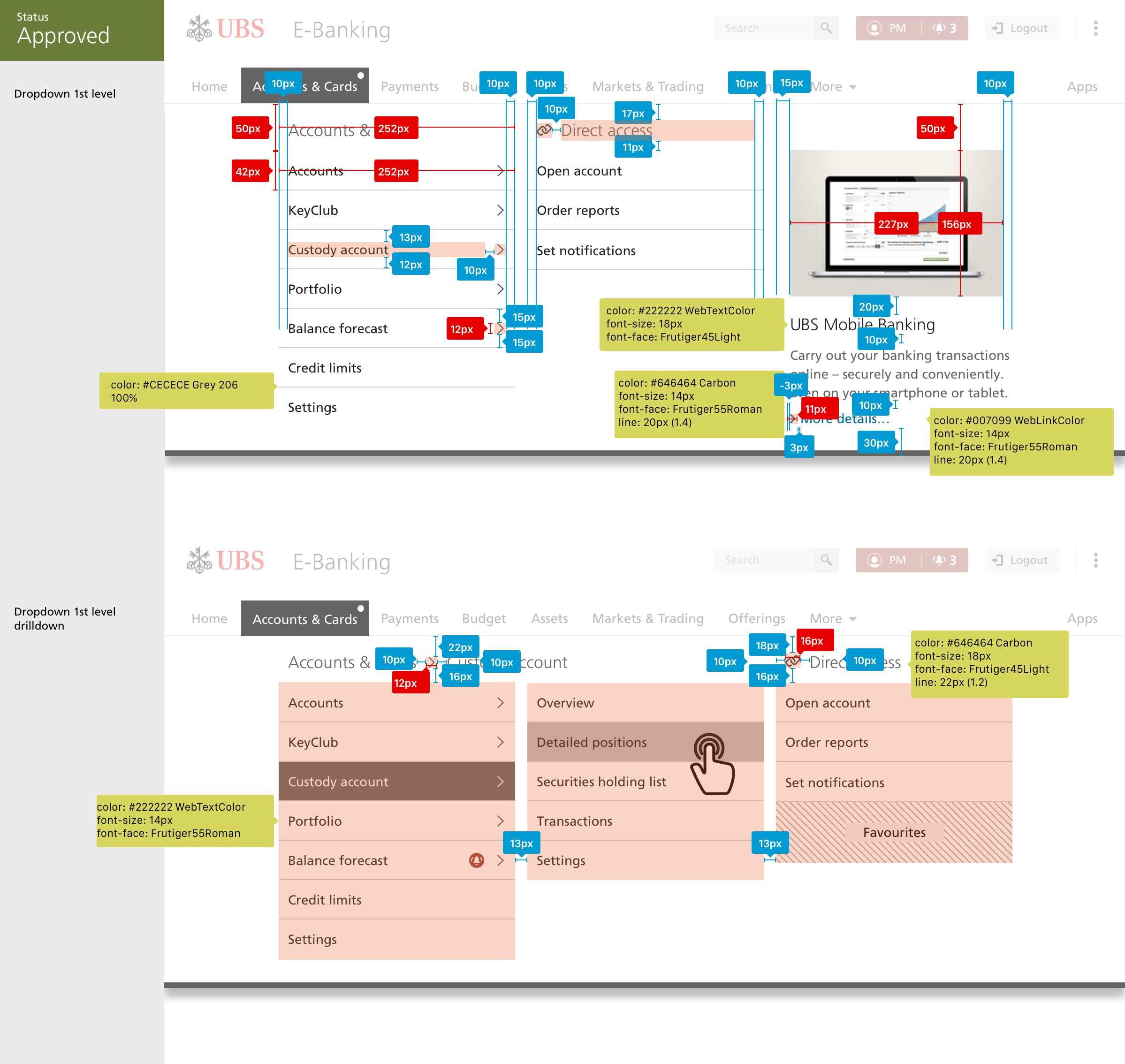
My focus centered on bringing absolute precision to the e-banking modules. Because we were managing highly sensitive financial workflows, every screen, state, and responsive layout had to be rigorously validated.
Bridging design and code
To ensure that what we designed was exactly what got built, the team didn't just stop at static screens:
- Storybook collaboration: I worked closely with frontend developers to align our designs with their Storybook libraries, ensuring that interactive components behaved correctly under real-world data stress tests.
- System-wide documentation in Frontify: For every module we refined, we didn't just document the final UI; we anchored it to the broader system framework. In Frontify, we mapped out the interaction rules, spelling standards, and behavioral guidelines for each component. This structure ensured that any designer or developer across the bank's digital ecosystem understood not just how a component looked, but the underlying principles of why it behaved that way.
Lasting Impact
This project was a major milestone in my career, marking my promotion to Senior Product Designer. Working alongside an incredible team where I learned immensely from my colleagues, we embraced the grueling, hard work required to bring simplicity to complex financial workflows. Navigating core banking modules while simultaneously contributing to the design system taught me how true quality is maintained at scale—through shared standards, rigorous documentation, and cross-functional alignment.
Key learnings
- The philosophy: By driving the documentation of the UBS Design Principles in Frontify, I deeply explored Swiss Design methodologies, Gestalt principles and strict accessibility standards.
- The takeaway: I learned that achieving true simplicity is incredibly difficult. It requires anchoring every design decision to logic, inclusivity, and a brand's long-term business strategy.
What I bring forward
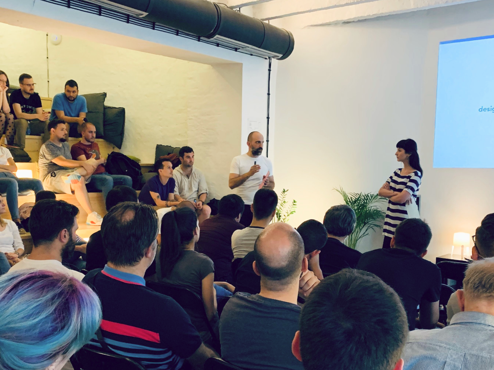
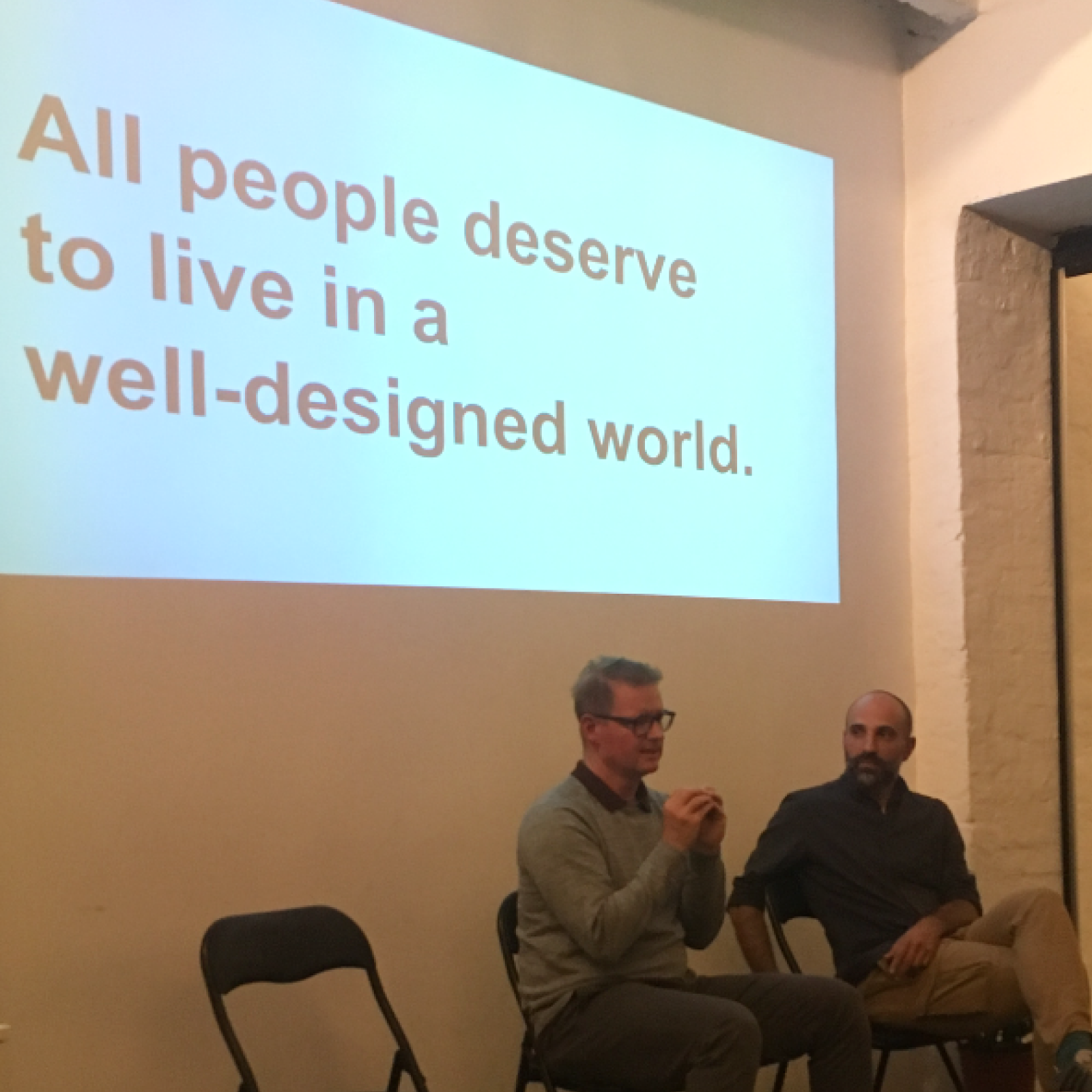
In the years that followed, I shared these system-scale insights through IxDA talks and later expanded on them by teaching the subject.
Today, I bring a proven track record of operating within complex ecosystems, a collaborative mindset, and the leadership required to turn abstract product strategies into scalable, engineering-ready design frameworks.