Loans at Celsius
Making crypto‑backed loans understandable — increasing completion from 12% to 21%.
The context & challenge
During my tenure at the company as it scaled from a 50-person startup to a major financial platform of over 650 employees, I designed experiences across core ecosystem pillars like the Wallet and Transaction domains, before spending a year driving the UX strategy for the Loans product area.
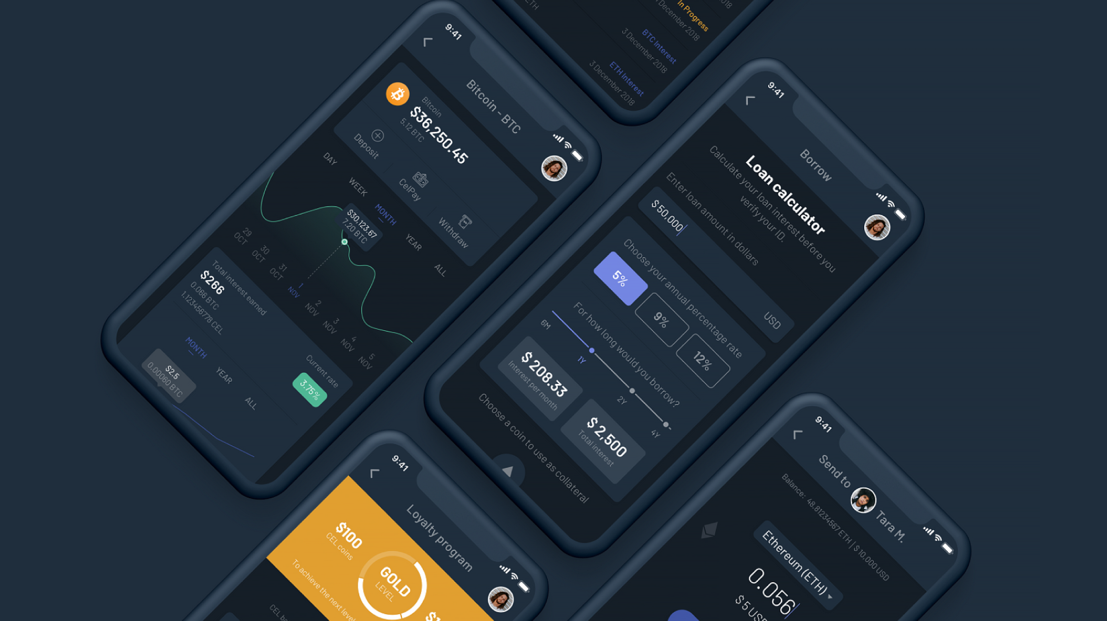
Crypto-backed loans were a foundational revenue driver, allowing users to borrow fiat or stablecoins against their digital assets without selling them. However, as the product expanded to a broader, non-crypto-native audience, we hit a massive friction point.
The problem
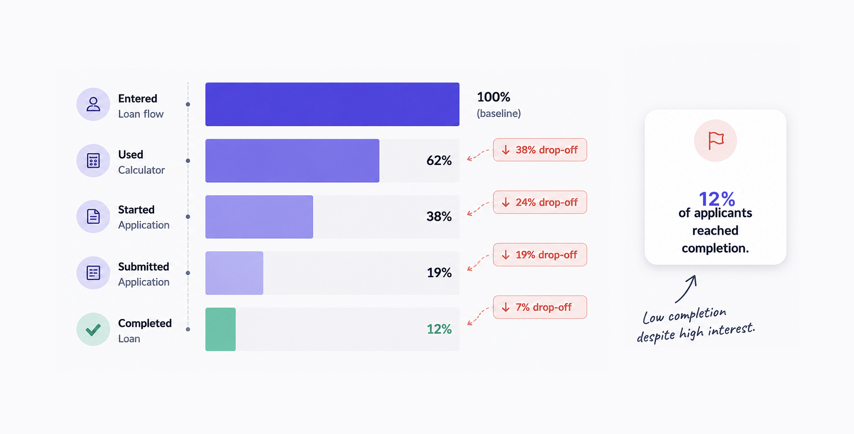
Despite strong intent and initial traffic, only 12% of users who initiated a loan application actually completed it.
The initial assumption: The broader product team assumed the application flow was simply too long or tedious, believing a quick UI cleanup and form shortening would fix the drop-off.
Research & deep discovery
Before jumping into wireframes, I partnered with UX researchers, product managers, and data analysts to run a comprehensive discovery phase combining product analytics, behavioral data, and user interviews.
Key findings:
- It wasn’t a usability issue; it was a comprehension issue. Users weren’t dropping out because the form fields were difficult; they left because they didn’t fundamentally understand the underlying financial product mechanics.
- The crypto–TradFi knowledge gap: While familiar with traditional loans, users deeply struggled with concepts native to crypto lending, such as collateral requirements, loan-to-value (LTV) ratios, margin calls, and liquidation thresholds.
- The calculator behavior: Behavioral data showed that users spent significantly more time on the marketing loan calculator than inside the actual application flow. They were trying to safely simulate risk before committing.
- The over-simplification trap: Historical attempts to remove complex financial terminology actually decreased user trust and understanding rather than improving it.
Strategy & ideation
We realized that to build trust, we shouldn’t hide complexity — we needed to design a way to navigate it.
I led the UX architecture and cross-functional workshops to shift the experience from a commitment-driven flow to an exploration-driven journey. We focused on:
- Reducing the perceived commitment of starting an application
- Radically improving transparency around market volatility and risk
- Injecting contextual, actionable education at friction points
The solution
I executed the end-to-end design system, interaction flows, and high-fidelity prototypes for a completely reimagined lending ecosystem.
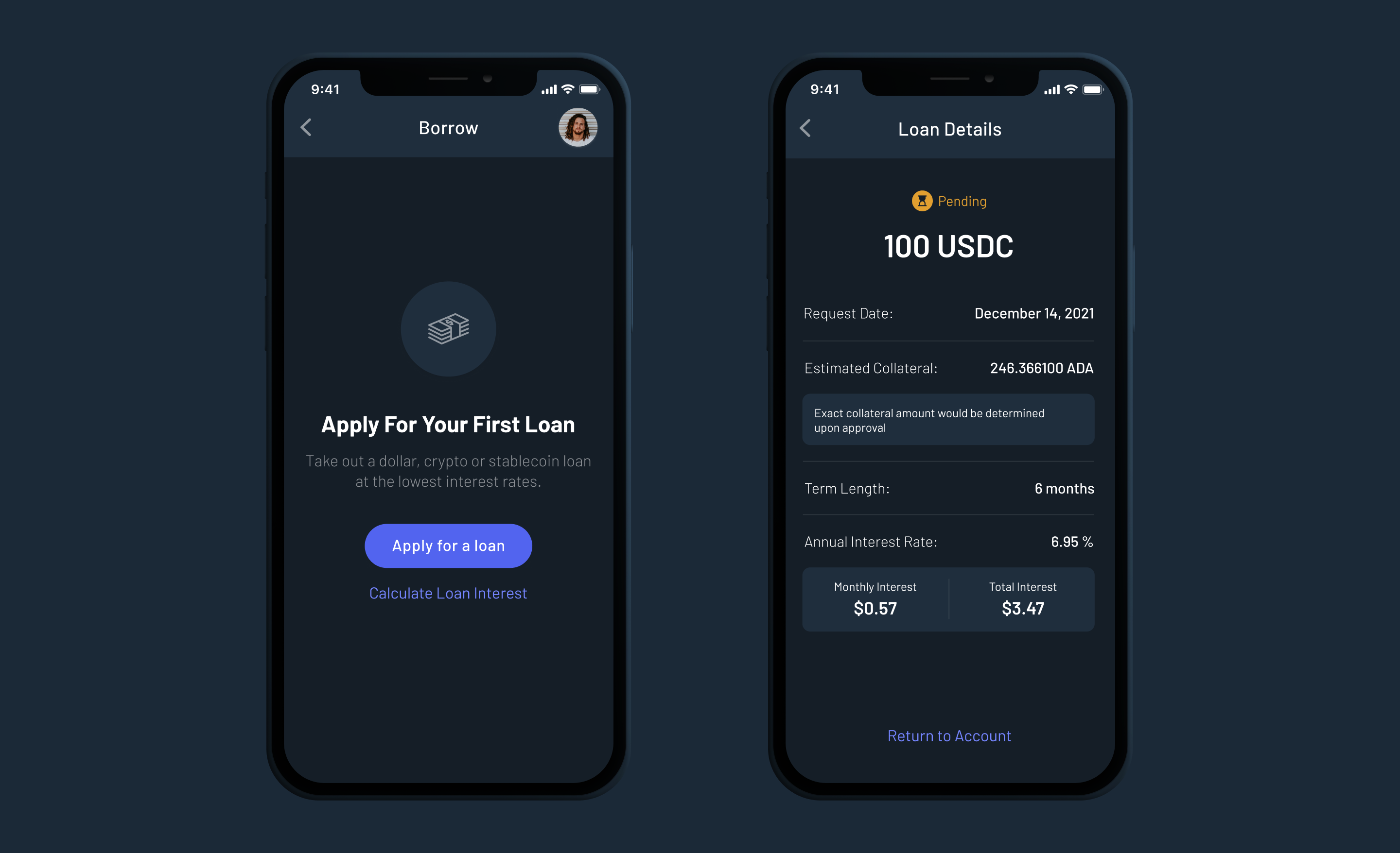
1. Turning a basic tool into an interactive playground
Instead of forcing users straight into a strict, stressful application form where they have to give their data right away, we built a safe, interactive screen where they could test out different scenarios first.
Users could play with the settings to see exactly how the loan worked:
- Test different amounts: They could slide a bar to change how much crypto they wanted to put up as collateral and instantly see exactly how much cash they could borrow.
- See the risks visually: They could safely test out "what if" scenarios (like, "What happens to my loan if the price of Bitcoin drops tomorrow?").
- No commitment anxiety: Because it was just a simulator, users felt safe exploring their options without the fear that clicking a button would accidentally lock them into a real loan.
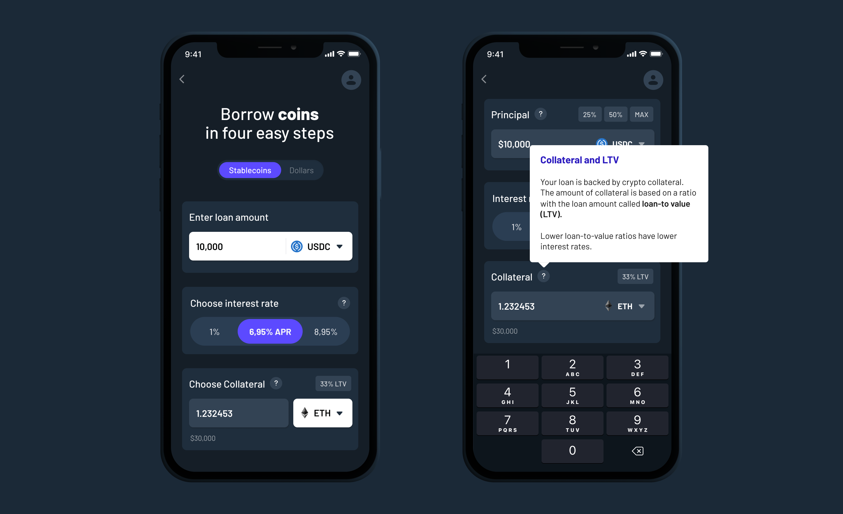
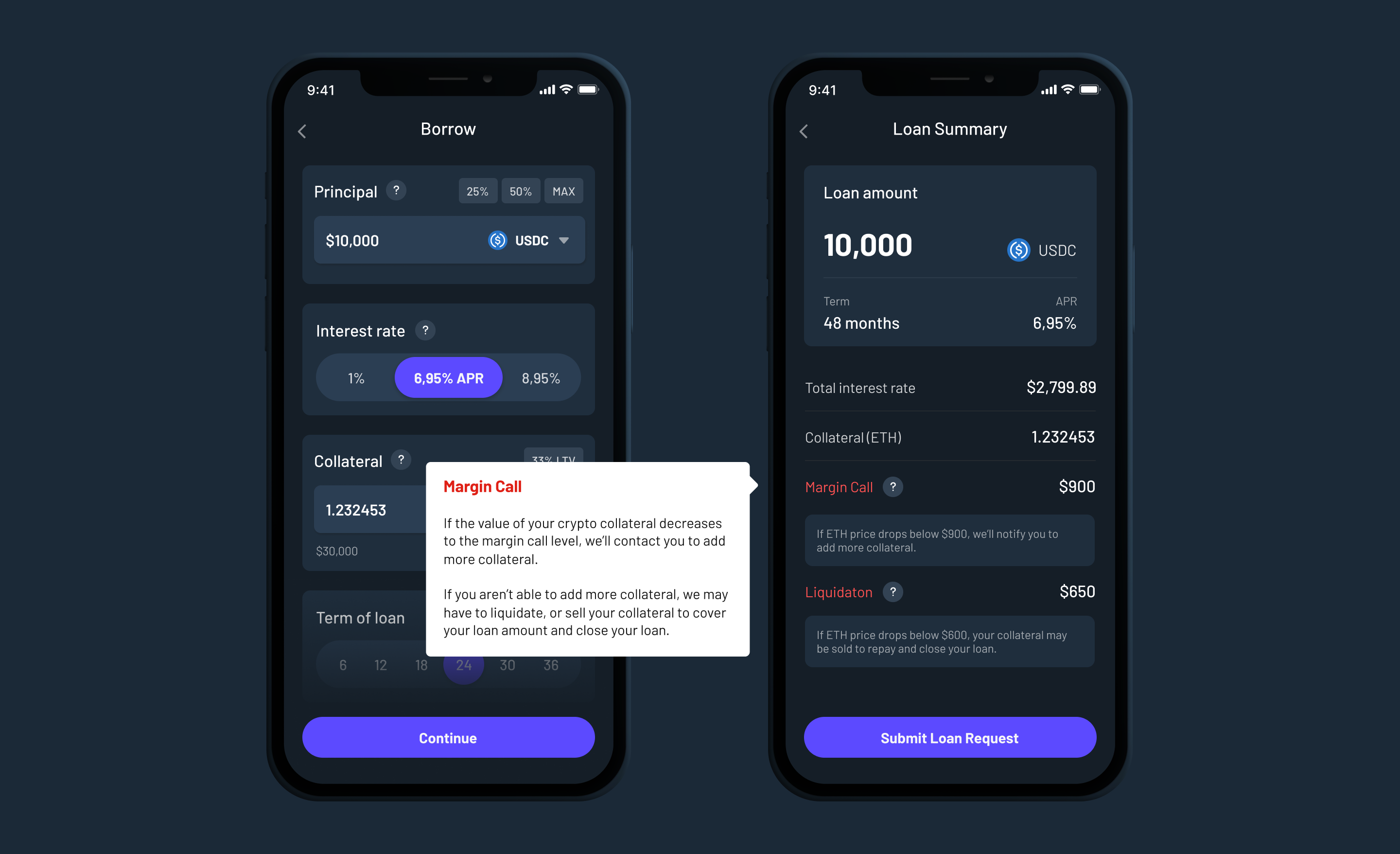
2. Radical transparency & progressive disclosure
Working hand-in-hand with UX writers and legal counsel, we chose to lean into the complex terminology rather than censoring it. We introduced a robust framework of progressive disclosure:
- Inline tooltips & micro-copy: Instant, plain-English definitions of margin calls and liquidation levels right next to the numbers.
- Dynamic risk visualizations: Visual meters that shifted from green to yellow to red based on the user’s selected loan-to-value ratio, making abstract financial risk tangible.
Outcomes & business impact
The redesign transformed user anxiety into user confidence, generating a massive lift in both performance metrics and product philosophy.
- A new product principle: Beyond the immediate data success, this project permanently established “Education as a Product Principle” across the entire organization.
- Cross-functional alignment: Successfully balanced highly technical engineering requirements, stringent compliance and regulatory guardrails, and user-centric design.
Leadership reflections
Complexity isn’t the enemy. In high-stakes financial products involving personal risk and trust, stripping away information for the sake of “minimalism” often destroys user confidence. Users don’t mind complexity if you give them the tools to confidently navigate it.
Data-driven empathy. This project proved the value of grounding design architecture in actual user behavior — leveraging the calculator — rather than relying on standard corporate assumptions about form lengths.