
This is my first time designing specifically for teenagers, so I wanted to understand the audience before making assumptions.
The product is part of a wider initiative focused on adolescent mental health, using real situations around relationships, peer pressure, asking for help and supporting others.
As part of our discovery, we heard from around 50 teenagers aged 15–19 in Serbia about their habits, needs and expectations. Here’s what we learned.
- How they react when they face a problem
- How they use and navigate digital products
- What makes an educational experience feel engaging
- What would make them come back and use it again
Get me in, quickly
One of the clearest findings was how little patience there is for friction at the beginning. 67.6% said pop-ups and permission requests can make them close an app, while 50% are put off by too much text, tutorials and explanations. Almost half also disliked being asked to create a profile or enter an email straight away.
For us, that means keeping onboarding short, avoiding unnecessary registration and getting to the actual content as quickly as possible.
Friends before Google
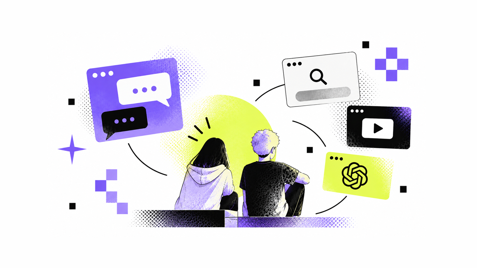
When we asked what they do when something is bothering them, 64.7% said they talk to a close friend first.
What I found more interesting was that 41.2% said they keep it to themselves and wait for it to pass. Only a smaller number said they would first search TikTok or YouTube, ask ChatGPT or Google, or talk to an adult they trust.
The product shouldn’t try to replace a friend, parent or professional. It can be a private place to explore a situation, think about possible reactions and maybe make the next conversation a little easier.
Learning through real situations
We described an app where you make choices in realistic situations and see what could happen next. 91.2% liked the idea or were open to it, but half said it would only work if the stories felt realistic and didn’t feel like someone was trying to “teach them a lesson.”
We still want it to have an educational purpose, but the learning should happen through the situation and the choices — not through long explanations.
The topics don't need to be dramatic
The most requested topic was recognising personal boundaries and emotional stress in difficult moments, selected by 79.4% of participants. They were also interested in peer pressure, conflicts with parents or teachers and risky situations online.
It was a useful reminder that relevant mental health content doesn't always need to start with the most serious or dramatic situations. Everyday moments can be a good place to start.
A place without judgement
I assumed engagement would matter even more for teenagers than for other audiences. But what they valued most wasn’t gamification. 67.6% said anonymity and a space where they wouldn’t feel judged would make them come back. New scenarios and challenges came next at 47.1%, followed by customisation at 35.3%.
So before adding more gamification, social features or rewards, they need to feel comfortable being themselves and trust that the experience is private.
That showed up in sharing too: 38.2% said they wouldn’t share anything from the app and would use it just for themselves.
Design for habits they already have
We asked how they prefer to interact with content. 67.6% chose continuous vertical scrolling, similar to TikTok, compared with swiping between screens, tapping through quiz-style options or browsing through menus.
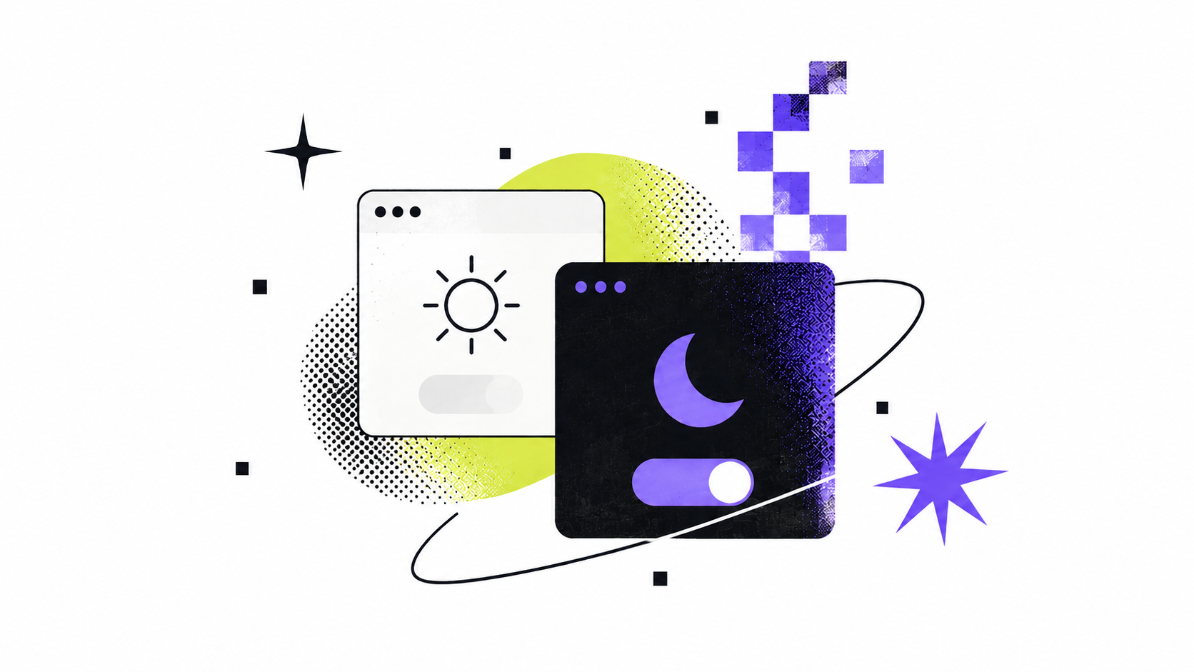
We also asked about appearance, and 73.5% preferred dark mode. Interestingly, more teenagers said they didn’t care which theme they used than preferred light mode.
The goal isn’t to copy the products they already use, but to make the basic interactions feel familiar.
QR codes felt more natural
Teenagers preferred QR codes over links. Scanning felt faster and more natural than copying or typing a URL — a small finding that changed how we thought about sharing and moving between physical and digital experiences.
Going forward
Less friction, more privacy, realistic situations and no lecturing. That’s what I’m taking forward into the design.
The app is coming soon. I’ll share the final experience once it’s live. Stay tuned.
Next post · 02